The lifecycle insight is designed to enable you to understand how your active users break down, highlighting those who have recently stopped being active or those who have just become active for the first time.
One of the most powerful insights you can get from this graph is understanding what's below the surface of your user growth. For instance, you could have stellar growth due to marketing efforts but churn users quickly. This could lead to huge trouble down the line as you'd be unable to retain enough existing users.
In addition, this gives you a place to start investigating issues like increased churn or a slowing acquisition of new users.
Creating a lifecycle insight
- Click Product Analytics on the left sidebar
- Click the + New Insights tab
- Select the Lifecycle tab
Configuring your lifecycle insight
Lifecycle breaks down whether a user has been active in your selected time interval or not and by whether they were also active in the previous interval.
To start with, you'll need to select an event that best describes activity for your product, this might be something as simple as logging into your app or loading the page. For example: in a messaging product, you might consider someone active if they've sent a message within the interval.
You can see here that I selected the "Sent a message" event to define my user activity metric:


As with other tools in PostHog, you can add filters if you wish to focus on a subset of these events.
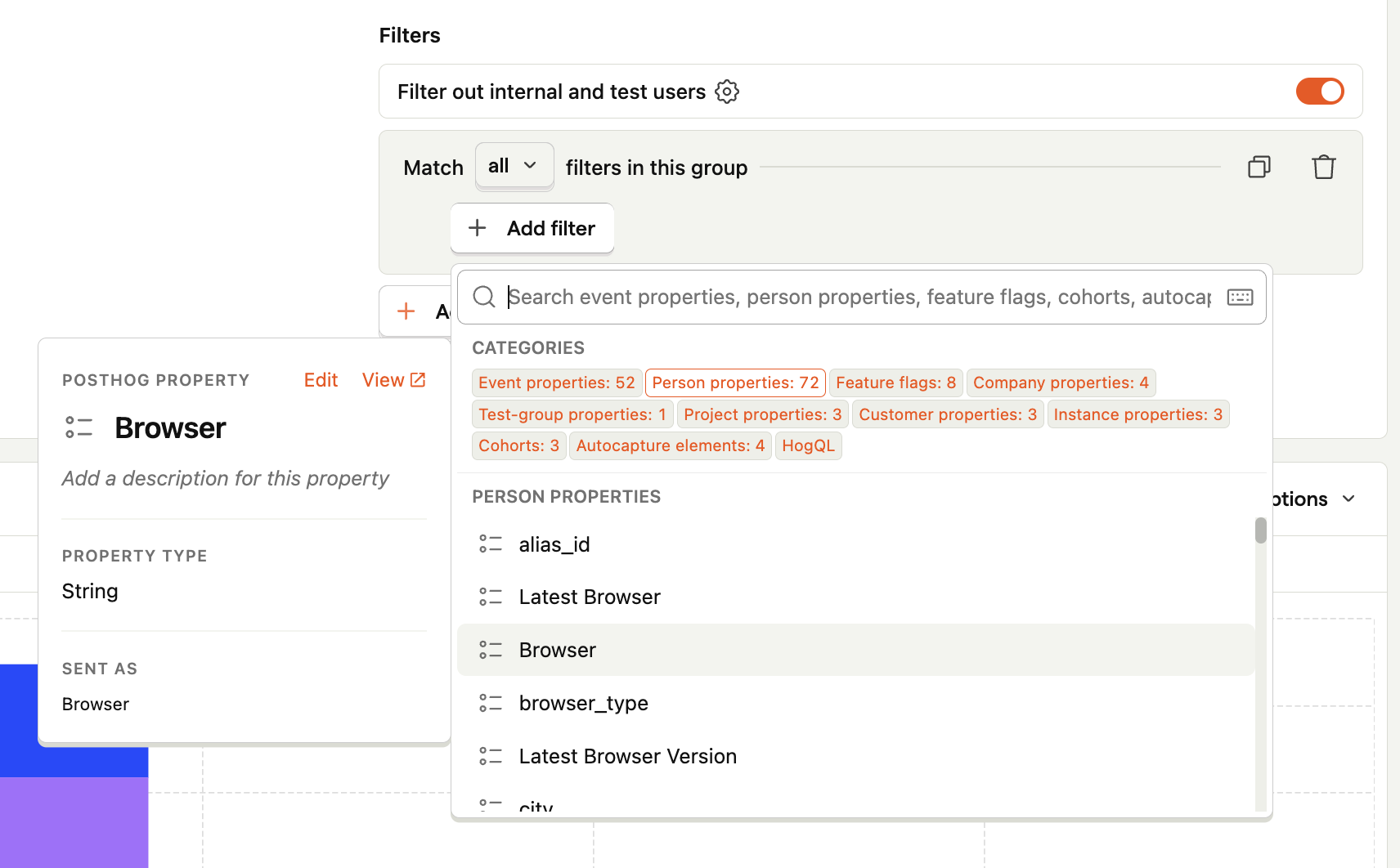
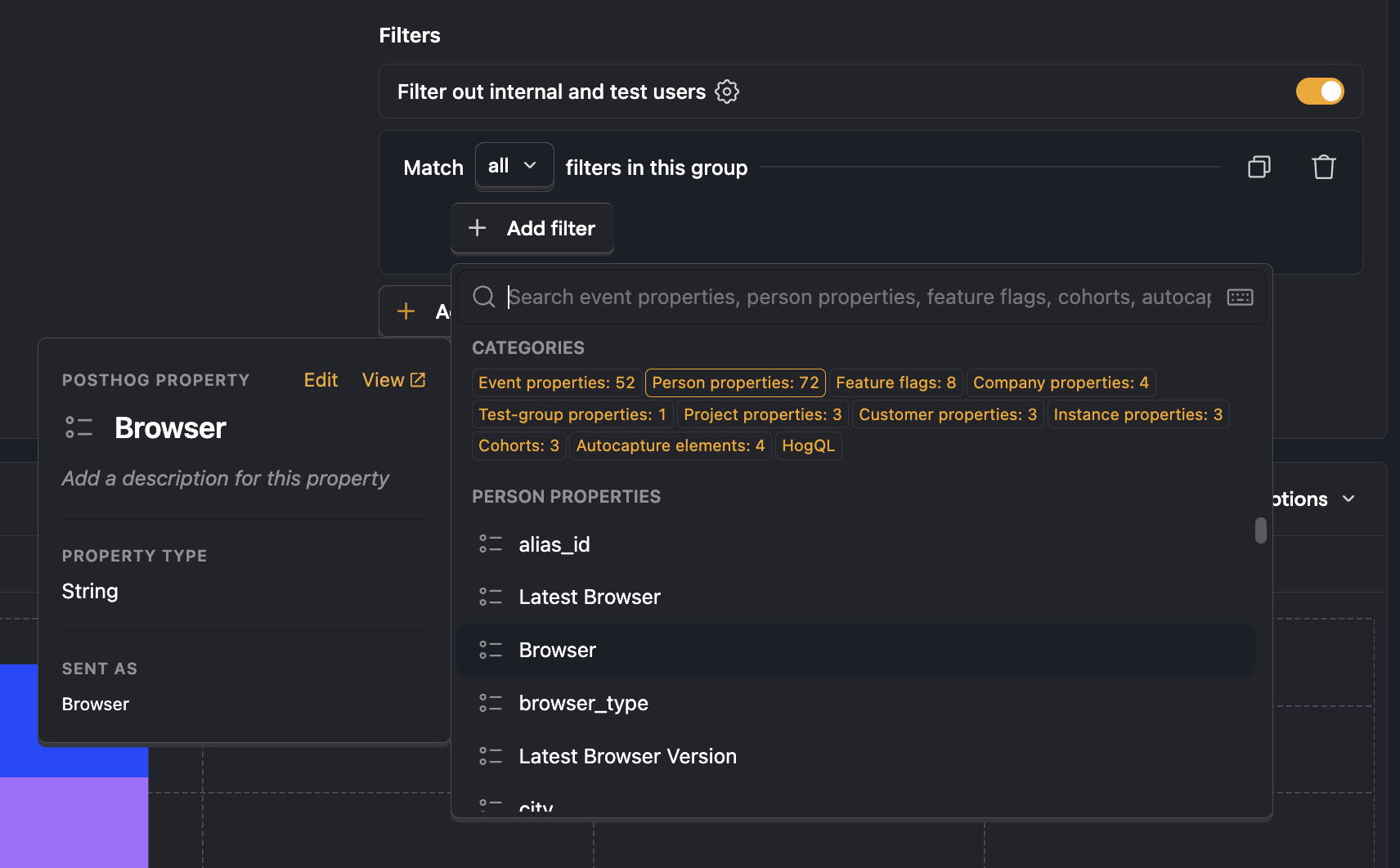
Next, set the time range along with the time interval aligning with the natural frequency of your product by updating the "grouped by" setting.
In this scenario, we group by "Week" as we expect people to be sending messages every week. Depending on how people use your product, you might want to group by "Hour", "Day", or "Month".


Interpreting your lifecycle
Our lifecycle chart for "Sent a message" looks like this:
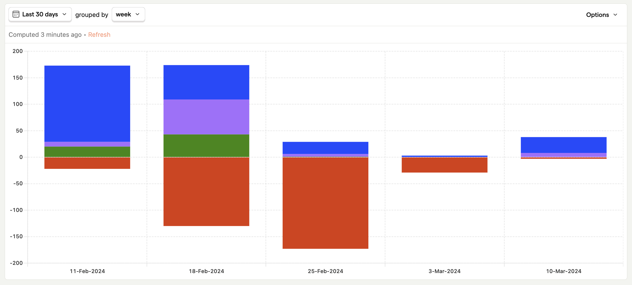
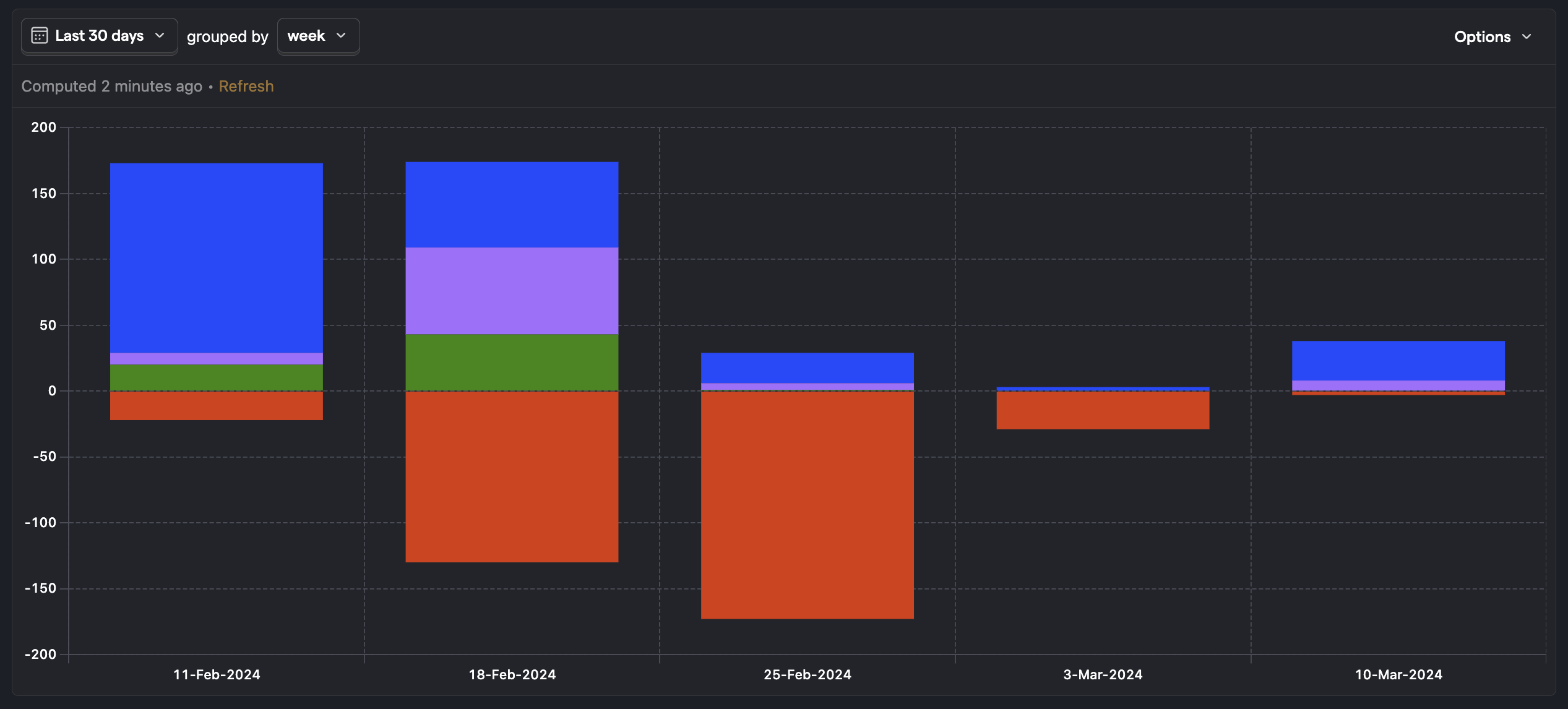
You can also click on the Option button and select "Show values on series" to display values on the chart for more details:
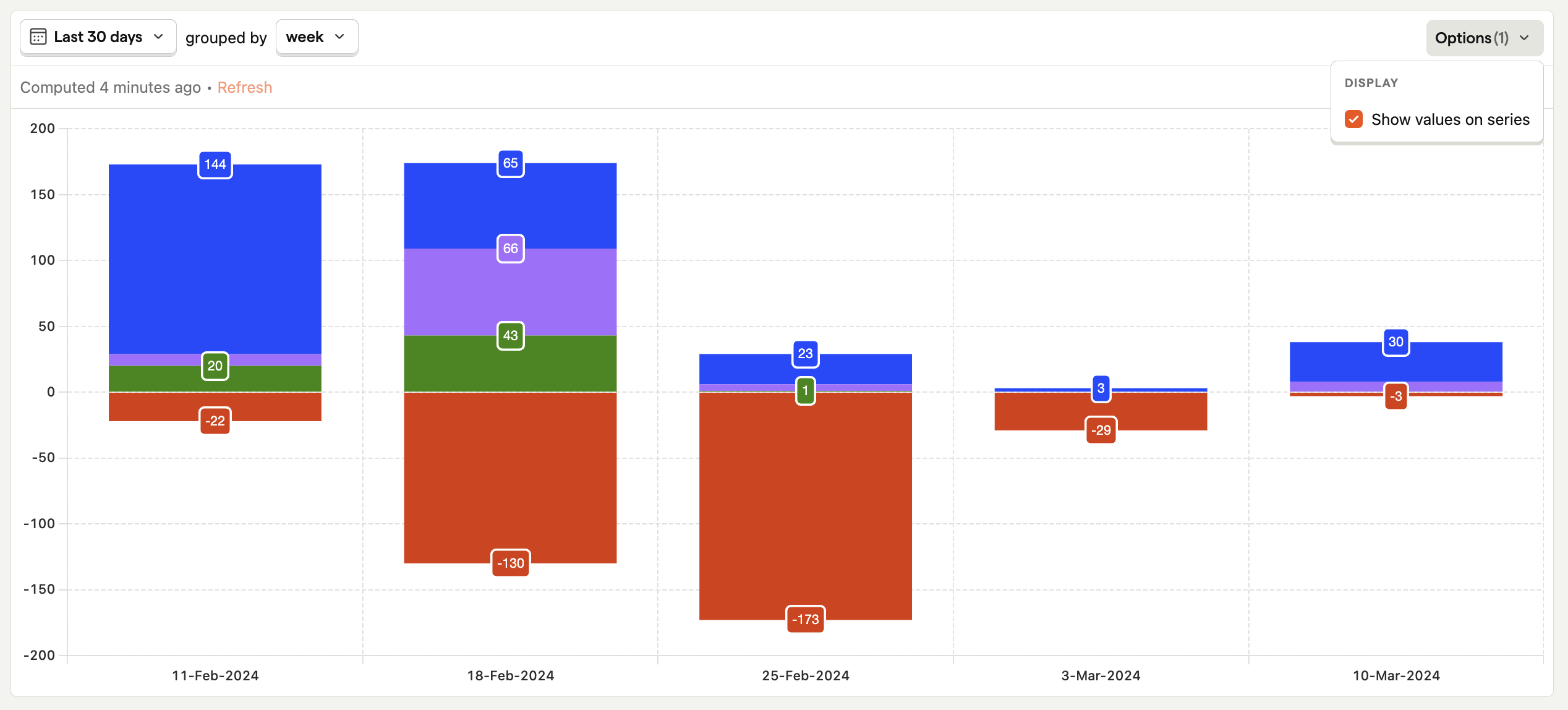
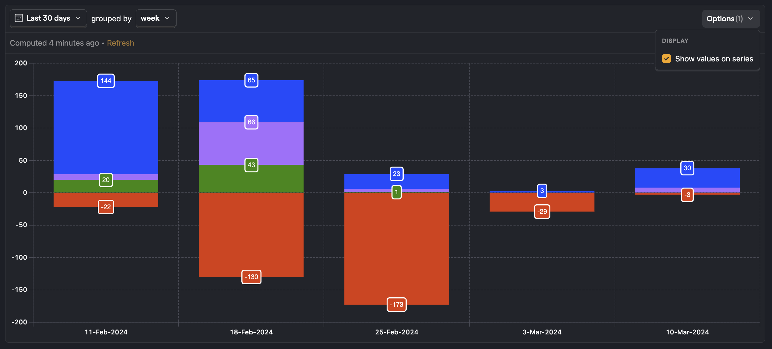
Everything above the zero line on the horizontal access represents a user who was active in the interval:
- New - Users who did the action during the interval and were also created during that period (e.g. Created an account and sent a message today)
- Returning - This is someone who was active in the previous interval and is also active in the current interval (e.g. sent a message yesterday and also sent a message today)
- Resurrecting - This is someone who was not active in the previous interval and became active once again (e.g. did not send any messages for 10 days, but sent one today)
Everything below the zero line represents a user who was not active in the interval:
- Dormant - These are users who are not active in the current interval, but they were active in the previous interval (e.g. someone who has not sent a message today, but sent one yesterday)
What to look for in your lifecycle chart? This can vary a bit depending on your product, but in a general sense:
- You want to see your "Returning" users growing or at least staying constant, otherwise this signals a leaky bucket problem.
- If you have a large number of "Resurrecting" users it could mean that the interval you selected is not aligned with your product's true natural frequency (e.g. users use it weekly but you're watching it daily),
- If you're investing efforts in acquiring new users to your product (or the feature you're exploring), you want to see that this indeed translates in new users popping up.
Going Deeper
Now that you have an overview of your lifecycle, you can now dig into ares which look problematic. In our graph we can see a big drop in active users on the 23 October. If you click on the graph of "Dormant users," we will show you the users who became dormant here:
With the information from this graph in mind, you may want to dig deeper to understand the following questions. Our Retention tool is better for answering this.
- Is our product getting better or worse over time? Are users being retained better and experiencing value over longer-term periods?
- Where is the loss of users coming from? Are users being lost from recent time periods or is it users who signed up / started using the feature a long time ago?
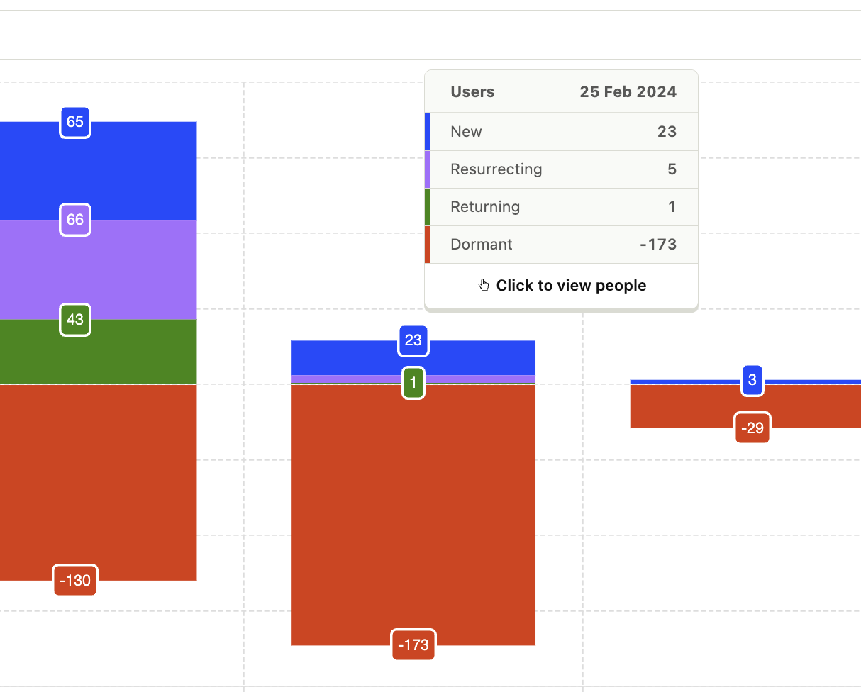
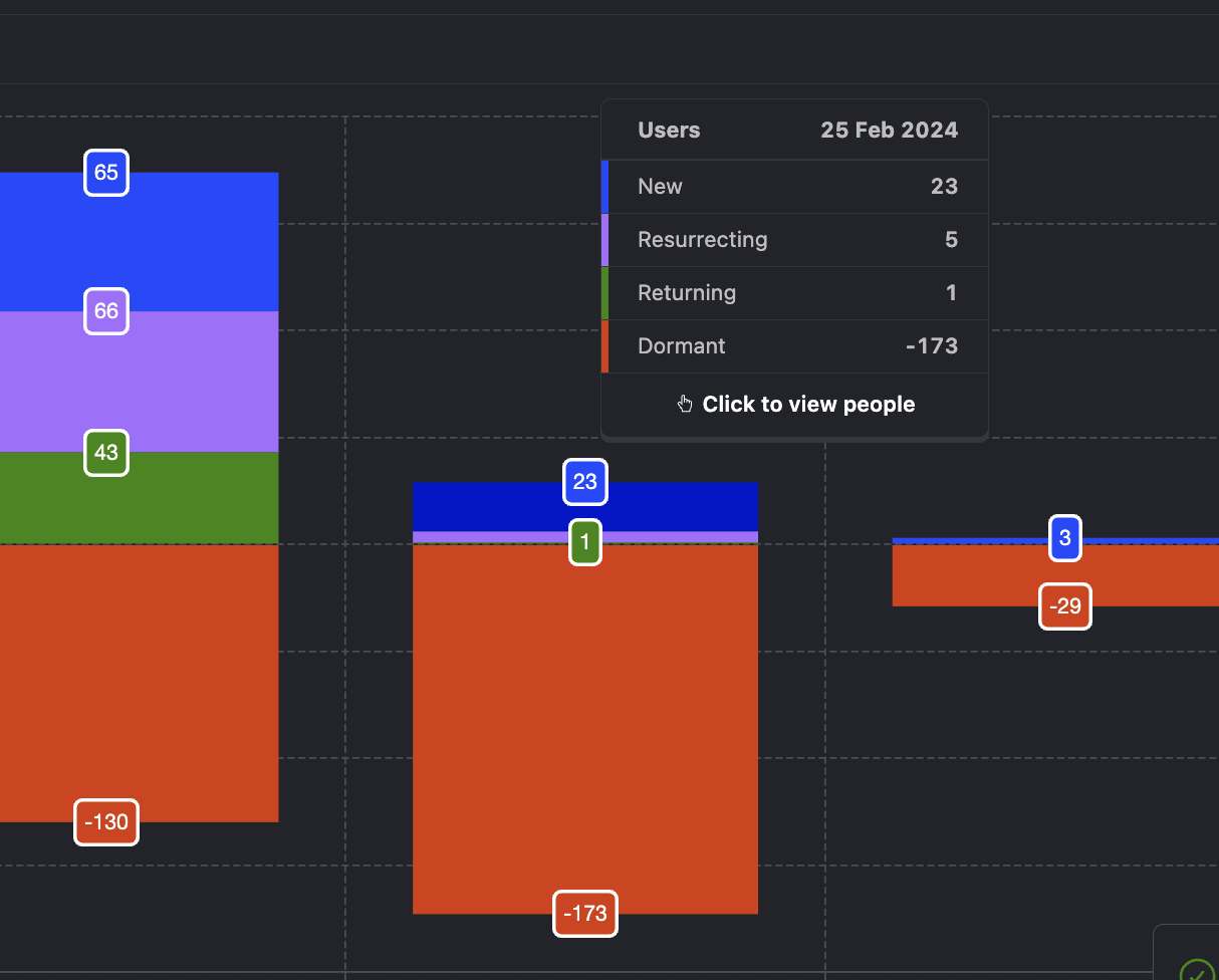
You can then click through to look at these individual users behavior in the events or recordings tools.
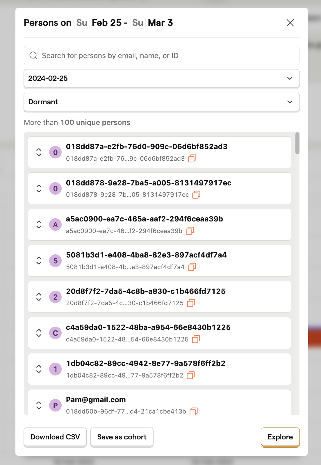
Or create a cohort for further analysis in the trends tool.